In May 2017 I bought a couple of tickets for a Premier League game from a very popular ticket selling website. The tickets were not delivered in time, because I didn’t include my flat number in the delivery address, so I missed the game.
When I asked for a refund, the company refused it, claiming that this was my fault. But, while indeed I was the one who did not enter valid data into the delivery address form, it was the software itself that allowed me to enter invalid data at that time.
That’s why eventually, I disputed the transaction via my bank and less than a month later the company ended up paying:
- Me a full refund (€260)
- The ticket merchant(I guess about €250)
- The MasterCard chargeback fee (€15)
The mistake I did was a result of inconsiderate user interface, that does not help humans achieve what they mean to and lets them do such mistakes.
Let’s dive into some details of what makes an interface inconsiderate and what can we do to build software that helps people achieve what they mean and avoid losing money in such silly ways.
On user interfaces
First, there are three things we need to remember about user interfaces:
- The user interface is the space where humans and machines interact
- The user interface is a software layer
- A user interface that lets people make mistakes, is inconsiderate
The inconsiderate user interface
What let me do this mistake (enter incomplete address details) is one of the simplest and most common user interface elements; an address form, which also makes it really easy to study.

First thing that came in my mind when viewing this address form was practically nothing, which translates to “this looks OK”.
What is easy to overlook here is how crucial this form is to the website’s business. This form will determine if the customer will get what they paid for or not.
Essentially, the website’s business gets harmed, by letting users enter invalid data in such a business critical form, the same as sending products to customers, without validating payment details and performing transactions beforehand.
Actually, it’s a little bit worse, as it includes also customer frustration and chargeback fees.
So, what can we do to such a simple user interface element as an address form to avoid input of invalid data?
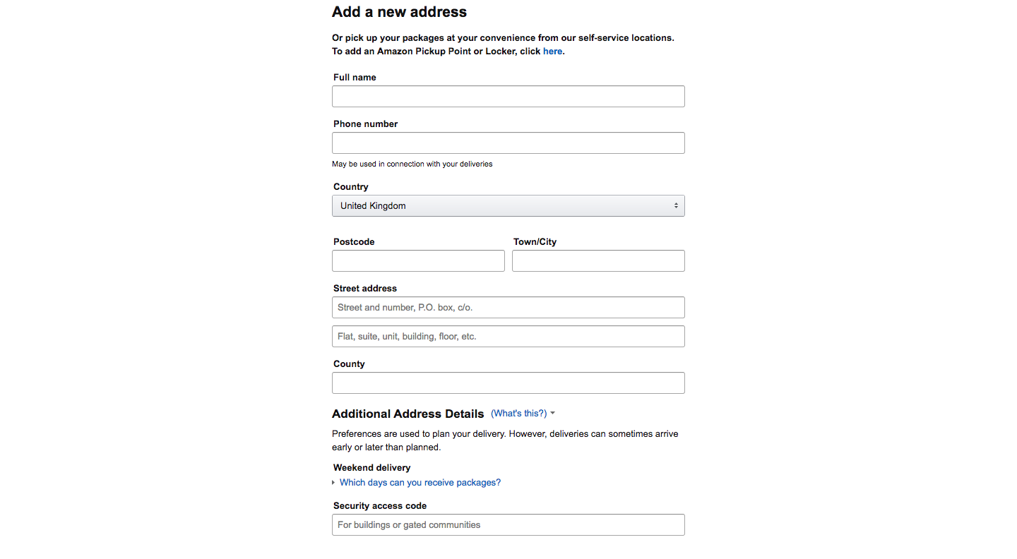
Amazon is nailing this in my opinion, since successful delivery of orders is crucial to Amazon’s business as well. Let’s take a look at their delivery address form.

Now, by looking at these two forms side-by-side we can instantaneously spot a few differences, but let’s break these down to understand why Amazon’s delivery address form is so much better than the previous one:
- It asks the right information, e.g. provides a "Security access code" field and the option get the package yourself from a self-pickup point to avoid potential delivery troubles.
- It clarifies potentially ambiguous fields, e.g. it has two "Street address" fields and indicates what kind of information should be input in each one (Flat number goes to the second field).
- It sets expectations, e.g. informs about delivery planning options and potential early or late deliveries.
This makes us understand that Amazon has put the thought and work to create a delivery address form that will help reduce unsuccessful deliveries by asking for the right information, clarifying potentially ambiguous input fields and setting expectations — it’s just thoughtful and considerate.
Note also that while there is nothing fancy about Amazon’s delivery address form, it makes the ticket selling website’s form look like a makeshift draft.
Usual mistakes
Via building SourceLair, reading a few books and facing this incident I have pinpointed 3 usual mistakes that lead to creating inconsiderate and harmful user interfaces (from abstract to specific):
User interface is not software
Its design might not require programming knowledge, but it needs the same (if not more) attention as the design of our database schema or API. It’s the space where the interaction with the customer will happen.
If it lets customers achieve what they want, it’s OK
When we reach a point where our user interface provides all features needed to let the customer achieve the desired result, we consider it complete. Rarely there are discussions about appropriate setting of expectations, reduction of excess information or redundant input.
Database-first design
We tend to think that database tables relate directly to user interface elements — especially when it’s so ridiculously easy to render a database table to an HTML form. That’s rarely the case. This also means that we tend to design with machines in mind, instead of humans, which is a logical fallacy when designing for the human-machine interaction space, for the following reasons:
- When we build software that interacts with humans, it’s always built for solving a human problem at the end of the day
- Humans are a less predictable source of input than machines
Conclusion
What I have in mind since this incident and everyone should is that:
People making mistakes should be considered part of the plan. Software that lets people make mistakes is just inconsiderate.
And, inconsiderate software will always cost money, because it will always frustrate users.
